As well as creating a music video to go along with our chosen song, we also had to create a digipak and magazine advert. This was in order to make the music video appear more realistic and professional, as if we were selling it for real. In order to keep our music video, digipak and magazine advert interesting to the public, we ensured they held similarities. This was also to make sure they were relatable to one another and recognisable.
In order to make our main product and ancillary texts work effectively together, we included both similarities and differences.
Similarities:
- Colour pallette/Natural environment
- Stills/images
- text/hand writing
- Natural movement
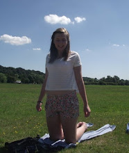
The similarities in the Colour Pallette/Natural environment of the main product and ancillary texts:
Throughout our music video and our digipak and magazine advertisement, we used similar colours. Often using natural colours, including autumnal colours and earthy colours. We used these colours as we wanted to use the natural environment. We also included similar shots in these environments:
 As you can see from these pictures, the inside of the digipak has a similar image as one shot included in our music video.
We also included many connections due to the season. We used shots of the trees in both the digipak and music video and also, of the leaves fallen on the ground. This further emphasises the continuation of the connections between our products and how we tried to relate the, all to our chosen song:
Digipak:

Stills from the music video:

Each of these images portray the same nature setting, each containing autmun colours and aspects. Inluding fallen leaeves, trees, and a slightly gloomy background colour, due to the season.


The similarities in the Stills/Images of the main product and ancillary texts:
In order to make the connection between and main product and our ancillary text more obvious and effective, we also used some stills from the video and included them in the digipak. This also emphases the connection between the two as they hold similar ideas. This will increase the selling of the product as it will be easily recognisable to the video, making the use of stills effective:
Digipak:

Stills taken from video:


The similarities in the text/hand writing of the main product and ancillary texts:
In both our ancillary texts, we used the same font for the texts and also the same 'hand written' style for the writing in both. For the back cover of our digipak and the main text on the advertisement, we used the same style font:


The text was simple reflecting the image we portrayed in our music video, simple yet effective.
We also used the same 'hand writing' effect text for the title of the advertisement and for the text on the front cover of the digipak. We done this by using the Wacom Bamboo tableton Adobe Photoshop:


We used this hand writing as we wanted the digipak and magazine to appear more personal and unique in order to suit the personal emotions of the music video.
The Similarities in natural movement of the main product and ancillary texts:
Troughout our music video, we were able to use the natural elements in order to make the female charcters hair move in the wind, to create a calm natural feeling, and to also emphasise the emotion. We wanted to carry this out in the ancillary texts too. We used wind constantly showing the links between both the music video and the advertisement:
Advert:
Music video:


However we also had some small differences between our main product and ancillary texts, these included:
- Inside panel of the digipak
- Editing of the digipak
- Tones of the colours in the main product and ancillary text
Differences between the inside cover of the digipak and the main product and advert:
The inside cover of our digipak was different to the restof our products as it contains a personal message written by Allie Moss herself. We did not feature anything like this in our video or advert. This was effective however, as it gives a more personal effect and as this digipak is easily related to the rest of our product, we believe it makes the effective as a whole.
Differences in the editing of the digipak compared to the main product and the advert:
The inside cover of our digipak and outside cover where edited differently to eachother and to the rest of our products. The inside cover was edited in order to appear less like the rest of our products, this was because our digipak included other songs,not just our featured song in our music video and advert. And therefore, we wanted to create the effect that other emotions were included throughout the CD,not just our desired emotion and effect.
Also the outside of the digipak is edited differently:
The outside digipak appears slightly brighter than the video and also contains polaroid images over a wood like background. By being different to the rest of the texts, this also emphasises different emotions, showing how the songs featured on the CD are different to our single featured song in our video.
Differences in the tones of the colours in the main product and the ancillary text:
As just mentioned the outside of the digipak is edited in a brighter tone to the music video. Like this, the magazine is also edited differenlty to the rest of the texts. Although, it is edited slightly darker than both the digipak and the music video. When placing the digipak, magazine and music video together, they all create different colours. This also emphaises that the songs Moss sings aren't just limited to the emotion we used in our feautered song for our music video.
0 comments:
Post a Comment