Sunday, 29 January 2012

magazine advert analysis

As a further part of our coursework, we are asked to create an advertisement for our song. Therefore, I have decided to analyse a music advertisement of Florence and the machine for her 2009 album 'Lungs' in order to. 


I think this advertisement for Florence and the machines album is particularly effective. Florence is centred in the middle, drawing the audiences attention to her also, she is the focal point of the image. 
The image also features lungs in the position of her actual lungs above the title of the album, 'LUNGS'. Showing a visual representation of the title, which is effective.  
The colour green is natural, the red of the lungs could be representing passion also, anger or danger. Florence is displayed as pale, therefore she stands out against the background. Furthermore, it could be representing her as pure tying in with the natural element presented in the photograph. 
The flowers further represent this, showing a natural and soft element towards the album and song. 
These elements could be illustrating what the album entails, Florence is a natural singer and sings from the heart and lungs you could say. Therefore, further emphasising the visual representation of the advert.  
Overall, I believe this advert is effective as it attracts the audience and the reflects the artist well. 

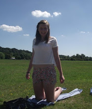
This advert linked to my on project;
This advert and the others our group have looked at has given us a start to the standard we need to meet. We would ideally like our advert to create something new and exciting for the fan base of Allie Moss yet, also reflect her. furthermore, we have discovered the advert doesn't always have to be over the top or overcrowded, sometimes simplicity works just as well. This is something we are planning on incorporating into out advertisement.

Friday, 27 January 2012

Advertisement - Components of the advert

There are a number of important aspects which must be included onto our advert. If all these are used it will look professional and to a high standard.
These important things to include are as follows:

  • The name of the artist
  • An image of the artist or associated with the music video
  • The artist's record label logo
  • The name of the album/tour
  • The date of the release of the album/tour
  • The location of the tour (if applicable)
  • The branded logo of the company which produced the poster
  • A star rating with a suitable source in which it came from

Sunday, 22 January 2012

Digipak inside cover; second draft

We were particularly happy with our original image chosen for the inside of our digipak and therefore, chose to stick with this decision. Although, we felt as though it needed to look more personal. In order to do this, we decided to add a paraphrased quote taken from one of moss' interviews shown below:


In order to place this new feature onto our original digipak, we had to use the 'lasso' tool on Photoshop. Below is an image of our second draft:

Thursday, 19 January 2012

Digipak outside cover; fifth draft

We believe this to be our final draft of the outside cover to the digipak. To complete the didgipak, we have added text to the spine creating an overall flow of the digipak. An image our final outside cover is shown below:

Wednesday, 18 January 2012

Digipak outside cover; fourth draft

In order for our digipak to be complete we would need to add on a tracking list and also, a barcode.
For our barcode to look realistic, one of the members of our group created it through the use of a tutorial which they allocated online, this can be found here


Furthermore, after researching many digipak's, we realised a section on copyright would need to be included on our digipak to make it more professional. One member from our group liked one particular example found on Adele's album '21' album cover. Therefore, we used a similar tet to the one she uses and also, included her URL. We then created a fictional record label; 'AM Recordings LTD'. We created this text using Photoshop. We ensured this text was smaller than the rest, although still big enough to be visible. In order to highlight the text more, we put a border around it using the 'stroke' feature on Photoshop. in order to do this, we used layers on Photoshop, first creating a layer and then clicking the fx option. We then had to choose the 'stroke' option:


As shown in the picture below, we were able to change the pixels of the font using the stroke option:


Digipak text track listing

In order to ensure the writing on our digipak went well with the genre of the images and the music we had to edit it. We decided to use photoshop as we were most comfortable with this photo editing software. Also, it has a very wide range of fonts and text sizes in which we wanted to choose from. 
Below is an image of a few fonts we have created in order to choose form:


We chose as a group the last text shown in the image was the text we were going to use as it fit in the most with the images.

Tuesday, 17 January 2012

Digipak outside cover; third draft

There isn't a vast difference between our second and third drafts for the outside cover, we have simply added the title and the artists name onto the first panel which will be the front cover. In order to do this, we used a Wacom Bamboo Tablet in photoshop, this allowed us to write directly on to he image where needed. We want the writing to appear more uniques and personal and we feel as though we were able to create this image through the use of this panel on photoshop. 
The image of our third draft is shown below:


Sunday, 15 January 2012

Digipak outside cover; second draft

Today we carried on with the digipak, we realised we were unhappy with the front cover picture. Therefore, we began to select different pictures for the front cover in order to find out which one would look best and suit the theme of the rest of the pictures featured on the digipak. Although, we were unable to find an image which suited the image alone. Therefore, we decided to experiment with photoshop. We were able to find a setting which turns the photo into a polaroid image. We decided this would be a good idea to use for the front cover as it would be different and stand out, also we would be able to use more than one image. We decided upon two images for the new front cover of the digipak. Our new idea for the digipak is shown below;


New front cover;


We are happy with this outcome as we feel as though all of the images and the colours match. We will be adding the writing soon and will post the final outcome when it is finished.

Friday, 13 January 2012

Starting our digipak

Today, we started our digipak. As a group we have decided to go through our video and take some screen grabs of the images in which we may use in the digipak. These potential images are shown below:


We have decided that for the three inside cover panels containing the the two disks we would like to use one long image across all of them and for the other three(the outside cover), three separate images. We have managed to come up with a rough idea of what we would like the images to look like, although we will be altering it and changing it around as we aren's completely satisfied with the outcome so far. Some images of the digipak so far are shown below;


The Inside cover;

The outside cover;


We have decided to change the saturation and contrast of these images to make them appear more brighter, making them more eye catching. This will hopefully make the audience more interested in buying our product. However, we found out that this was too bright for the idea we wanted our music video to portray and consequently our digipak. Therefore, we added fill layers over the top in order to soften the photos, matching our desired effect more. 


On the outside cover, we have decided that the right hand panel is the weakest and doesn't match the other two panels. Therefore, we have decided to brainstorm as a group for some new ideas;


Plans for today

Today we are planning on beginning our digipak, we are going to decide upon the pictures to use and where to place them on the digipak. We are also going to decide whether they need to be edited or not. 


We are going to use a 6 sided digipak, with two panels containing disks, one of which is the actual song CD and the other a DVD of the music video. 


An example of how we are planning on laying out our digipak is shown below:

Wednesday, 11 January 2012

Digipak - creating a template

We used photoshop to draw lines of the correct dimensions whilst keeping the remainder of the document translucent. This will allow us to quickly put our images into the template without having to adjust the design. Therefore, saving us time and making the design process more efficient. 


An image is shown below:


Tuesday, 10 January 2012

Further digipak anlysis - powerpoint

In order to understand a digipak and the things to include, I decided to analyse a digipak from coverdude.com.Below is a powerpoint I was able to share on slideshare:

Analysis of student digipak


Today I analysed a past students digipak. I thought the digipak was good and in some ways looked professional. Although, some aspects looked unprofessional. For exmaple, the image on the inside of the digipak looks more professional than the image of the girls on the front. This image looks unprofessional as you can tell they are just a group of friends due tot he sectioning and the white boring background. Furthermore, the images are similar to an extent. But in my opinion I do not feel as though they flow as much as they could do. However, I do think they back cover looks good and professional due to the different colours and heels. It stands out and is unique. Overall, I do think this digipak was good. However, I feel as though we could perhaps learn from their mistakes and make our own digipak stand out more and hold more professional quality characteristics.  

Sunday, 8 January 2012

Digipak - collecting ideas

After completing the research for our digipak, we decided to try out taking some pictures that we could include in it.


The image above was taken by a member of our group recently, I edited the image and cropped the main character out. This would be a good picture to include as it is simple and could be easily be used on our digipak as a continuous image. This would make it look more proffessional. Also, I feel as though this image is relevant as it carries the image we would like to portray in our music video and digipak. 

 The above image was also taken by the same member of our group. We believe this image would be relevant as it has a vintage feel about it and it would be eas t include as we could simply ask a member of the video to include it. This would be good as the video and digipak would be connected because of this maing it more effective - we hope to create this image. Although, the left of the image has quite a large empty space. This could be boring and ruin the image as the fact that the image would stretch across three sides. Two of which would be plain and therefore boring.

This image above is the same image I included early, but the uncropped version. This image would be nice to use as it features a member of our group. Furthermore, the rest of the image is interestig and pleasing to the eye and looks relevant and will create a connection betwen the image of the digipak and video.
The image would need to be cropped to fit on the digipak, one member of our group edited this to see what it would look like. This image is shown below:

We believe the edited image is still effective when cropped and would look good for the digipak.

Above is another image we are considering as it involves blury lights and we believe it looks effective because of he blurred image.

Friday, 6 January 2012

Digipak - what to include

Today in class we discussed what to include in the Digipak. By doing this we can ensure that we include everything needed to make it look as it was a professional digipak. 
There are five things to include which are essential:

  • Six panels
  • A spine
  • A barcode
  • The track list
  • The disk impression
There are also a few more element we could add but they are not essential, these include:

  • Band info/booklet
  • Poster
  • Flyers
Below is an image which a member of our group created which shows the things we can include. I will look at this and our group can discuss what we want to include in our digipak:


Wednesday, 4 January 2012

Ideas and research for the Digipak

Part of our coursework is to also create a digipak for our music video and song. It needs to be appealing to the eye in order to be eye catching and gain an audience and also needs to interpret the song. Furthermore, it should be similar to the ideas of the song on the CD and to the same quality. In order to complete this task to a high standard, we have opted to research into previous digipaks in order to gain some ideas of what we would like to include in our digipak. By knowing what we would like to include, we can begin to take pictures for our digipak and start to edit and create it. 
I looked on coverdude.com in order to find a digipak to look at. One digipak I thought particularly interesting was 'Play on' by Carrie Underwood shown below;


The front and the back image show images of a beautiful women and catch the audiences eye. We would like to achieve this ad catch the audiences eye. The image of the flower on the CD is also eye catching and continues with the genre you can gain from the front of the Digipak.


I found this image on www.deviantart.com, I think this image would create a great effect in our video as it is simple and easy to create with fairy lights in a tree or a distorted picture of traffic lights for example. 


Both the images above are beautiful and idillic, both of which we want to include in our music video and believe images such as the ones above will be easy to create. 

Monday, 2 January 2012

Ellie Goulding - Digipak analysis video

Over the weekend, we recorded ourselves analysing Ellie Goulding's, 'Bright lights' digipak. Below is the edited product;